the design of kura
kura kura was a turtle-guided emotion journal for youth in Singapore; it closed in 2026.
back to kura kuraorigin
[ORIGIN MOMENT: who was in the room, what prompted the first sketch — a whiteboard session, a stray doodle, a brief from a co-founder. Name the specific trigger, not a generic "we wanted a mascot" framing.]
Placeholder paragraph continuing the origin beat: where the sketch happened, what was drawn first — the shell, the face — and how quickly it stuck as "the" turtle versus being one option weighed against several others.
influences
[INFLUENCES: what the designer was actually looking at — specific reference mascots, illustrators, or design movements. Name real touchstones if known; avoid a vague "cute mascot culture" gesture.]
Placeholder paragraph on why those particular references mattered for a mental-health-adjacent product: what they offered in restraint or roundness, and what was deliberately avoided along the way.
evolution
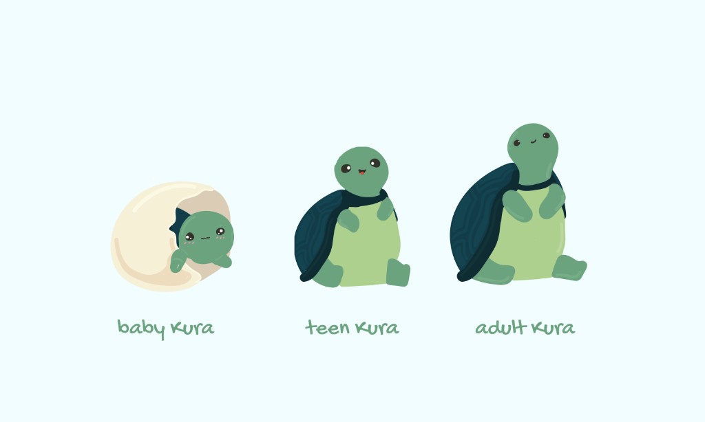
Placeholder paragraph framing the sketches below as a real progression, oldest first, including the versions that didn't work and were set aside.
the face
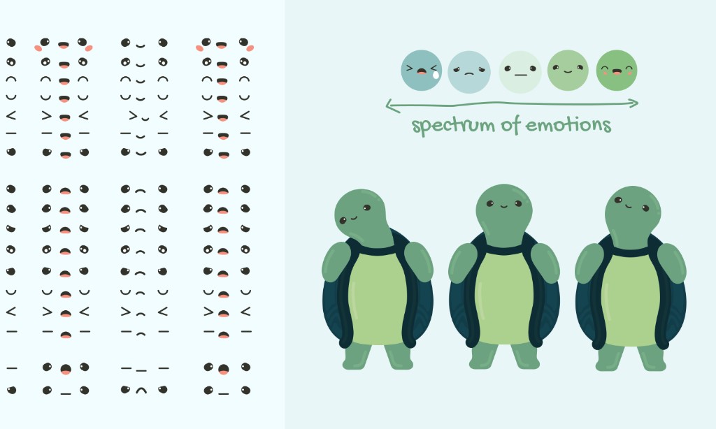
Placeholder paragraph stating the requirement plainly: a mascot inside an emotion journal cannot perform an emotion at the user, or it undermines the premise that the user is the one naming their own feeling.
Placeholder paragraph on what "flat" meant in practice — which features were pulled back or removed, and why a neutral face reads as safer than an expressive one in this particular context.
[DESIGN CONSTRAINT DETAIL: any specific rule the designer held to — a self-imposed limit on eyebrow movement, mouth curvature, or similar — if known.]
Placeholder paragraph on the tension this created: a deliberately inexpressive mascot is a harder sell internally, and harder to defend visually next to warmer, more animated characters, than an expressive one.
Placeholder closing paragraph tying the flat face back to the app's core mechanic — the user supplies the emotion; Kura does not supply it for them.
process
Placeholder paragraph on the drawing process itself: tools used, the iteration method, roughly how many passes a typical asset went through before it was considered final.
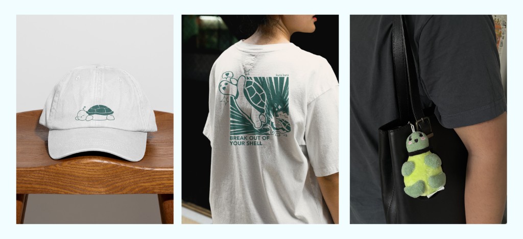
Placeholder paragraph on what changed once the design had to survive as embroidery on a cap — line count, color count, minimum stitch size, and which details from the digital version had to be simplified or dropped entirely.
the cap
Placeholder paragraph on why a cap rather than a tee — durability of embroidery versus print, cost of goods for a small leftover run, or a wearability reason specific to the material.
Placeholder paragraph on why the turtle motif is kept small on the cap rather than given a large, front-and-center placement.
All proceeds go to Over The Rainbow (OTR), a Singapore non-profit supporting youth mental health.